Python-1.数据分析Matplotlib使用
条评论Matplotlib官方定义:Matplotlib is a comprehensive library for creating static, animated, and interactive visualizations in Python. Matplotlib makes easy things easy and hard things possible.
Matplotlib为数据可视化Python Package,根据Numpy提供的ndarray数据结构来绘制图像。
图像基础知识
英寸(inches)
尺寸,比如图像尺寸、屏幕尺寸;比如一寸照片、经典iPhone4s屏幕尺寸3.5英寸;1英寸=2.54厘米;
像素(pixel)
像素,是指图像的最小方格,是图像中不可分割的元素,是图像中的最小单位;像素可由RGB颜色组合而成;
分辨率(resolution)
分辨率,是指在图像/屏幕水平方向和垂直方向上的像素个数。如100*80,水平方向含有100个像素点,垂直方向含有80个像素点;
DPI(dot per inch)
像素密度,又叫屏幕密度,指的是每英寸上的像素数,数值越大,图像/屏幕越清晰;
matplotlib图形组成
matplotlib主要有Figure(图形/画布)、Axis(坐标轴)、Axes(坐标系)、Artist(绘制对象)组成,如图所示:
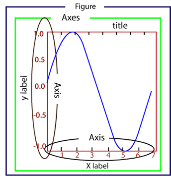
用代码画图跟艺术家用笔画图原理是类似的,选一张什么尺寸、颜色、材料等的纸,在纸张上进行构图布局,然后再进行作画,画什么内容,用什么颜色。同样,matplotlib,要先创建一张画布(Figure),可指定大小、背景颜色、边框等,可设置坐标轴(Axis),建立坐标系(Axes),在画布上生成图像元素(Artist)。
matplotlib基础绘图
1 | # pyplot import method |
图一,该图为Python运行后,生成的默认图片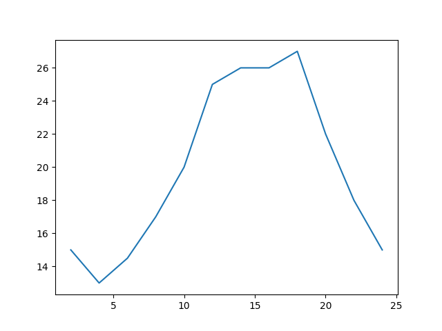
图二,该图为在jupyter内运行生成的图片,两者还是有差别的,经过仔细对比研究,发现jupyter的图像分辨率长宽为原生Python运行的一半。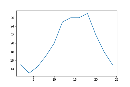
从这几行代码画出的图像中(图一),可以看出以下几点:
- 图像画布默认的大小为[6.4, 4.8]英寸;分辨率dpi为100.0;背景颜色为白色;边框颜色为白色;折线的默认颜色为‘#1f77b4’;经查阅matplotlib官方文档;
- 这里有个dpi和分辨率的换算,水平分辨率为$6.4\times 100 = 640$,垂直分辨率为$4.8 \times 100 = 480$ ,图片分辨率为$640 \times 480$。
- 可通过figure类的参数设置,来改变图片大小、分辨率等。
- 可调整x轴和y轴的间距与设置描述信息
设置图片大小、分辨率、颜色
1 | # pyplot import method |
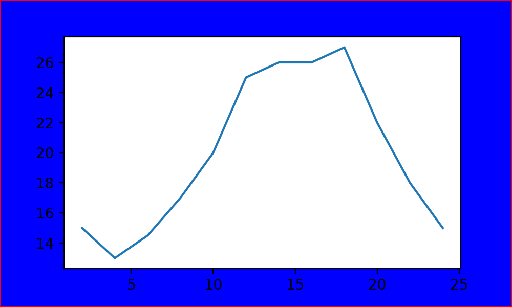
- 图片尺寸,水平宽度为5英尺,垂直高度为3英尺;DPI为200,分辨率为$1000 \times 600$ ;
- 图片背景颜色为蓝色(blue);边框宽度为1;边框颜色为红色(red)
设置坐标轴间距与描述信息
1 | # pyplot import method |
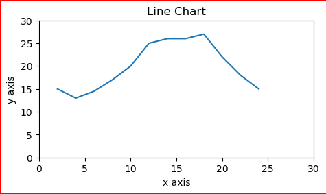
- add_axes的rect参数代表显示的百分比部分,可以看到left为从10%开始展示,最后侧边框的红色部分没有展示出来。
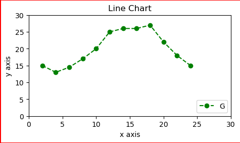
设置线条样式
| 颜色代码 | 含义 |
|---|---|
| ‘b’ | 蓝色 |
| ‘g’ | 绿色 |
| ‘r’ | 红色 |
| ‘c’ | 青色 |
| ‘m’ | 品红色 |
| ‘y’ | 黄色 |
| ‘k’ | 黑色 |
| ‘w’ | 白色 |
| 线条表示符号 | 含义 |
|---|---|
| ‘-‘ | 实线 |
| ‘–’ | 虚线 |
| ‘-.’ | 点划线 |
| ‘:’ | 虚线 |
| 标记符号 | 含义 |
|---|---|
| ‘.’ | 点 |
| ‘o’ | 圆圈 |
| ‘x’ | X |
| ‘D’ | 钻石 |
| ‘H’ | 六角形 |
| ‘s’ | 正方形 |
| ‘+’ | 加号 |
| ‘v’ | 倒三角 |
| ‘^’ | 三角 |
| ‘<’ | 左三角 |
| ‘>’ | 右三角 |
1 | # pyplot import method |
设置显示中文
环境用的是mac,anaconda,首先要查看环境支持那些中文字体;
1 | conda install fontconfig |
1 | # pyplot import method |
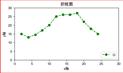
matplotlib折线图
1 | import matplotlib.pyplot as plt |
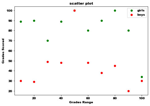
matplotlib散点图
1 | import matplotlib.pyplot as plt |
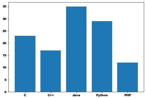
matplotlib柱状图
1 | import matplotlib.pyplot as plt |
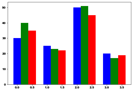
matplotlib多次柱状图
1 | import numpy as np |
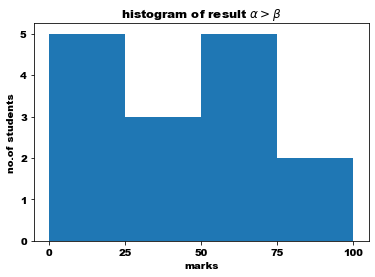
matplotlib直方图
1 | from matplotlib import pyplot as plt |
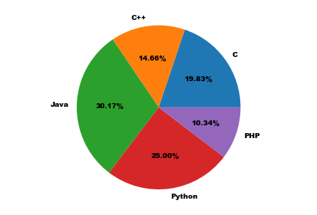
matplotlib饼图
1 | from matplotlib import pyplot as plt |